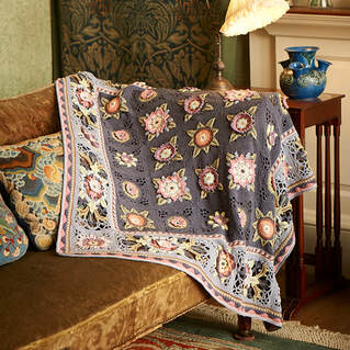
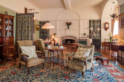
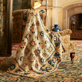
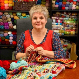
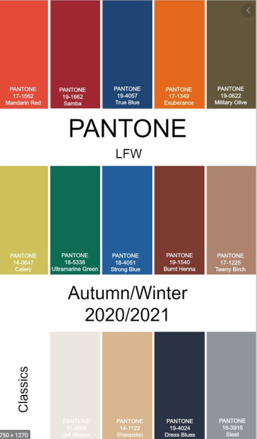
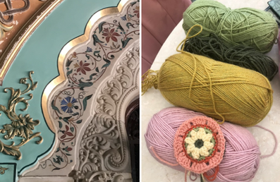
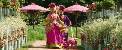
Janie Crow
  • Home
  • SHOP
  • PROJECTS TO MAKE
    • CROCHET ALONG >
      • BOHEMIAN BLOOMS
      • BLOOMSBURY AND SUSSEX GARDEN
      • CLIMBLING ROSE WRAP
      • FRIDA'S FLOWERS
      • INDIGO AND CRIMSON DREAMS
      • LILY POND
      • LOVE IS ENOUGH
      • SUNSHINE & SHOWERS
      • SPIRIT OF FLORA
      • THE FRUIT GARDEN
    • BLANKETS & THROWS >
      • DELFT
      • EASTERN JEWELS
      • FIELDS OF GOLD
      • FIORI
      • IMOGEN
      • INDIAN ROSES
      • JEWELLED STAR
      • MAGIC CIRCLES
      • MARRAKESH PERSIAN TILES
      • MEXICAN DIAMONDS
      • MYSTICAL LANTERNS BLANKET
      • PEPPERCORN PERSIAN TILES
      • PERSIAN TILES
      • ROYAL GARDEN
      • SANDALWOOD
      • SUMMER PALACE BLANKET
      • THE BLUE HOUSE
      • WILLOW BLOSSOM
    • SHAWLS & WRAPS >
      • GLAD TIDINGS WRAP
      • HOLLICARRS
      • LOTUS FLOWER
      • MAGIC CIRCLES
      • MEXICAN DIAMONDS SCARF
      • MYSTICAL LANTERNS SCARF
      • MYSTICAL LANTERNS SHAWL
      • SUMMER PALACE WRAP
    • CUSHION COVERS >
      • KELMSCOTT & MELSETTER
      • GERTRUDE & MURIEL
      • OONAGH
    • DECORATIONS >
      • BEADED DECORATIONS
      • FESTIVE DECORATIONS
      • FESTIVE MINI STOCKINGS
      • GLITZY STOCKING
      • JULIE'S BUNTING
      • SPARKLE & SHINE BEADED DECORATIONS
      • TWINKLE BUNTING
    • ACCESSORIES >
      • BEADED PINE WINTER MITTS
      • BEADED POUCHES
      • CATALINA BEADED POUCH
      • HALLEY BEADED POUCH
    • FREE PATTERNS >
      • EMILY SHAWLETTE
      • ESTELLA
      • TEMPERATURE BLANKET
  • BOOKS
  • RESOURCES
    • LEARN TO CROCHET
    • FREE TECHNIQUE DOWNLOADS
    • YARN SUB DOCUMENTS
    • ERRATA
  • NEWS
    • BLOG
  • ABOUT
    • DECADE OF DESIGN
    • EMMA BALL & JANIE CROW
    • MARY MAXIM & JANIE CROW
    • YARNSMITHS & JANIE CROW

September Newsletter

18/9/2020

 
Picture

​September Newsletter


Welcome to this month's bumper newsletter. We have quite a lot to tell you about this month - if you want to see my quick video that summarises the theme of the newsletter then click here or on the image below. 
 ​
Picture
I have also recorded a technique video as a response to your questions from last month. The video focusses on crochet techniques for joining blocks, as this was the most popular question. In the video I talk about my preferred joining technique and also cover a few other common joins. You can find the video here.
 ​
Picture

​We have received a lot of requests for me to show other techniques, but are open to more suggestions, so if there is something you want to know about please get in touch and we will add it to the list of things to be featured in the future. You can ask a crochet related question or something more relevant to me and my design work (although you may find an answer to one of these type of questions has already been covered in my key note speech). You might want to ask me something more personal, like what is my favourite chocolate bar (Double Decker) or how old my children are (25 &22) for example. It is up to you!


A few of you have asked about how I select my yarn shades to use in projects. Sometimes I have a clear idea of a palette before I start and other times I just swatch and swatch until I am happy with my choices. You can find more information about how I choose a palette lower down this email as it ties in brilliantly with the theme for this months newsletter which is the 2020/21 Autumn/Winter trend forecast, but before Gemma, Sarah and myself launch into that I just want to update you on a few other things, so please stay tuned....

​

***
My
 Crochet Design Career

​

You may remember that last week I told you I had recorded a key note speech for the UK Knitting & Crochet Guild. The video is now live on the Guild's YouTube channel and you can find it by following this link alongside loads of other really interesting videos by designers and Guild members. Within the video I talk briefly about how popular crochet was during the Victorian era with Queen Victoria herself advocating the craft. As much of the history of crochet is unclear it is difficult to know exactly where Victoria's fondness for the craft came from, so I was intrigued to hear from guild member jinnybee_crochet that the Queen may have been influenced by her German governess Leisel (Louise Lehzen) and then later on in her life by her embroiderer Frances Lambert, who also wrote about knitting and crochet. You can find a free to access online version of her book 'My Crochet Sampler' by following this link or by clicking on the image below.
 ​
Picture
Picture
                                                                            One of Queen Victoria's Dolls 
​
I love the fact that some of Queen Victoria's dolls from her childhood have parts of their outfits that are crocheted, like the one in the image above, but there is still a lot of mystery surrounding the origin of the craft other than that it seems to have derived from an embroidery technique called Tambour. If any of you are more in the know than I am and would like to share your knowledge of the history of the craft within this newsletter, then please get in touch. Perhaps some of you have some pieces of ancient crochet that have been passed down through the generations or perhaps some of you remember your grandparents talking about items they may have made - I would love to hear from you!

***
 
Kelmscott & Melsetter Cushion Covers
​

The pattern for the Kelmscott and Melsetter cushion covers are live on my web site and you can find it by following this link. The patterns for the two cushion covers I have designed to match the Fruit Garden blanket are the Kelmscott cover, which matches Recipe 1 and Melsetter, which matches colour way 2. 
 ​

Picture
Both cushion covers feature in the same 12 page pattern and we have now put the metal dome buttons that I used on my cushion covers into stock - these are on a back order as we are not expecting them to arrive until next week. You can find them here.
​

Picture
Picture

I designed the cushions so that you can use up some of the left over yarns from your CAL projects but you will need some extra balls of some shades to complete it (you can find the yarn use listed here). I am aware that it is still tough to find yarn for the projects. If you are looking for Life DK, there is still some in stock over on Andy's Just Knots web site here. If you want to make the covers using the Naturals - Bamboo + Cotton yarn then you are in for a short wait as that is due to be back in stock within the next couple of weeks.

If you can't find the shades you want, then you could make a couple of substitutions: For example I suggest Special DK Parchment or Life DK Oatmeal in place of Life DK Parchment as this is one of the shades proving difficult to source.

William and May Morris were famous for mixing many of their designs together. In their interior designed rooms they would place tapestry cushions on printed fabrics and feature layers of wallpapers, friezes and borders on the wall, all with different patterns and colour palettes. I love to mix my patterns and colours too and think that the cushions would look fabulous made in alternative palettes to the blankets. I put a few examples of some ideas for alternative palettes using some of May's wallpaper and fabric designs and have also found a couple of lovely suggested palettes on line that may inspire you:
 ​
Picture
Picture
Picture
Picture
Picture
 
Standen House, the National Trust property designed by Phillip Webb in the Arts & Crafts Movement style, was the feature of this weeks Channel 4 programme featuring George Clarke. The house is where we photographed the fruit garden CAL project and if you saw the programme you may have recognised some of the rooms.
​

Picture
Picture
Picture

If you do not already have a Channel 4 account and you want to watch the programme, you will need to create one - it is free and well worth signing up to as all the programmes in George's 'National Trust Unlocked' series look really interesting.

Don't forget that the 2 cushion covers will be the focus of Stylecraft's September 'Make Along' and you can find the dedicated Facebook Group by following this link. The Make Along Facebook Group has been created by Stylecraft to provide a forum for knitters and crocheters to receive help and have a general chat about projects designed by the Stylecraft Blogstars. There are already more than 10,000 members in the group and it is a hive of positive activity, so why not take a look?

You can choose from a download version or a paper copy of the pattern. The download version is free with an option to make a donation via PayPal if you want to. The paper pattern is priced slightly lower than my other 12 page patterns at £3.95 and will incur a fee for postage and packing.

***

Persian Tiles - Eastern Jewels

The first time I met Lucia Dunn of Lucia's Fig Tree I knew we were going to get along! Lucia embraces life in vivid technicolour and is an expert at devising her own vibrant colour ways for crochet projects.
 ​
Picture
Picture
​The first project we collaborated on was Lucia's version of my Frida's Flowers blanket and so I was really pleased that she and Stylecraft later collaborated to recolour my Persian Tiles blanket - a design that remains my best selling pattern to date.
 
Lucia's version of Persian Tiles is called Eastern Jewels and for the last few years the yarn substitution document that you need to refer to in order to make the blanket has only been available within the yarn kit, but now I am so pleased that you can get it as a download version directly from Lucia's web site here.
Picture
Picture
​Please note that to make the project you will also need a copy of my original Persian Tiles blanket pattern. You can purchase it as a download either via Ravelry or Etsy, or as a paper brochure copy here.
 

Choosing your own colour palette
​

I am asked about how I pick yarn shades a lot and so I thought I would give you an insight in this newsletter. Here is a question, sent to me by Kim Wilhelm, which summarises brilliantly the questions I am often asked:

'On both the Frida's Flowers and Persian Tiles, I've gone off on my own colorwise. I'm really not a kit person, because I think picking the colors is the best part of any project! Color inspires and excites me, as I'm sure it does you - that's clear from your lovely patterns! But in the various Facebook groups I belong to -both for your designs and others - there are so many people who struggle with color selection.
So my question for you is this - how do you approach color?
Do you have a process for selecting the color palettes for your projects?
I know that the palettes for the ongoing Fruit Garden CAL were inspired by May Morris designs as shown in your most recent newsletter, but all three kit palettes are very different. How did you narrow down your final selections?
Also, I'm not sure you get much time to crochet for fun, but when you do--does your color selection process for personal projects differ from your process for selecting kit colors? Are there any colors you don't like, and does that enter into your selections?' 

​
Picture
My reply:

Obviously choosing what shades to wear is different to choosing those to use in a project for the home. I tend to stick to wearing greys and blues, whereas my crochet design is a hotchpotch of every colour. Sometimes I have a very clear idea of how I want a project to look before I start the design process and other times I let the crochet tell me where the design theme is going and therefore what shades to start looking at.

At the beginning of a project, instead of making definite decisions about a colour palette, I tend to surround myself with a ball of each shade from my chosen yarn bases and pick out the colours I wish to use as I crochet, at times ripping back wrong choices or sewing in or adding surface crochet to see how a palette is working. Colour is incredibly important in my design work and sometimes it can be hard to find exactly the correct shade I need, especially if the yarn range is constrained by a limited number of shades. This is why I often mix yarn types in my designs.
​

Picture
When I was young my Mum was really proactive when it came to making me aware of all the artistic things going on around me. My brother and I were lucky enough to be brought up in London – a city full of exciting ‘arty’ stuff and a wealth of historical artifacts and places to visit. We were taken to museums and exhibitions, treated to trips to the theatre and encouraged to read. When I was about 12 years old I remember being taken to an exhibition that focused on the influences of Picasso and Matisse. Many of the paintings were from the true ‘impressionist’ era, but towards the end of the exhibition a few of Matisse’s huge paper cuts were displayed. I remember being bowled over, not just by the size of these pieces, but also by the amazing use of colour – bright blue and green, acid yellow and fuchsia pink screamed from the walls. The fact that Matisse made many of these pieces from the confines of his sick bed in the last few years of his life proved to me that the guy was a total genius and from that day forward I was not only totally in love with him as an artist (there is not a single Matisse painting that I do not like) but I was also totally smitten with colour.
 ​
Picture
I love bright colours and I love designing with them, but many people I meet tell me they are frightened of colour. That they are scared to make decisions about yarns based on colour choice and perhaps even nervous of deviating from a suggested colour palette. As someone who works with colour all the time I used to find this quite surprising. I used to wonder why people can't decide on a personal colour palette. Why does it frighten people? I used to think that maybe I was just lucky enough to have an ‘in built’ flair for putting colours together or that perhaps I had a colourful gene! However, within the last ten years or so I have realised that, rather than being born with a genetically passed on understanding of colour, what I have actually ended up with is a confidence when it comes to using colour which is a result of thinking about it pretty much all of the time and therefore 'opening my mind up' to it.
 
This all sounds a little bit psychedelic and hippyish, but think about it - How often do you think the average person, in every day life, really thinks about colour? Us knitters and crocheters are a different breed, we think about colour a lot because we are constantly looking at yarn and colour combinations, but I reckon the majority of people don’t give colour a second thought and that the only time they really think about it is when they are clothes shopping and want to find something that suits them.
​

Picture
​It is my experience that when workshop participants are asked to choose a colour palette from an array of yarns they will invariably choose a tonal palette – pink and purple shades are a common choice, as is a mix of brown, yellow and orange. Rarely people add an accent colour or make a surprise judgement, such as adding bright aqua blue or pea green in with their tonal choices. This is not a criticism, it is what feels like the right thing to do. We are shown examples of tonal colour ALL the time, so it is totally logical to choose colours in this way. If you are in the UK and you were to walk outside your front door now, I bet the predominant colours that you will see are green, grey, beige, brown and dull red, possibly against a blue sky if you’re lucky or a little bit of blue sea is you’re even luckier! Tonal colours are what we see the majority of the time and (as colour gets diluted in light and space) it is rare that we actually take on board just how bright a colour can be or what a mixture of colours are all around us.
 
If you live in the UK or Northern Europe, whether you live in a city or not, your surroundings will have a similar tonal value, be it green fields or grey office blocks. In contrast, think about what your view would be if you were on a tropical island, surrounded by bright blue sea, butter yellow sand, luscious green palm trees and pinky red tropical flowers. Think about what colour choices you might make if this was your every day view. Hawaiian shirts and Bermuda shorts illustrate my point beautifully – colour choices of designers are made more often than not as a reaction to their surroundings. The artist William Turner spent years looking at how colour changed depending on where he was in world and you can find a great essay entitled 'How to spin the colour wheel, by Turner, Malevich and more', which looks at colour theory and how some of the world's greatest artists put it into practice on the Tate web site here.
 
The craft of crochet gives us a the ideal medium to play with colour and I think it is only since I have been crocheting that I have become more confident with colour. Crochet allows me the chance to ‘design’ with very little planning. I can start with just a few stitches and end up with a couple of hundred, playing with colour after colour row after row. With knitting or sewing you have to make some big decisions before you even start, but with crochet you can just ‘go with the flow’.

Try starting with a ring of about 5 or 6 chain and then, working in rounds of double or treble crochet, start building your crochet piece round by round. Surround yourself with lots of yarn – regardless of weight or texture. You could even choose some ribbons, buttons and beads to add accents of amazing colour and just set to crocheting, adding in random yarn shades, snipping away the old one, or carrying it along for use later on, until you start to see colour combinations that you really like.
 
Picture
Many people find it hard to work in such a freeform way and like to do a bit more planning before launching into something. Why not have a walk around your home and search for something that has a surprising colour palette? It might be a plate (or a group of plates) or one of your favorite scarves. Try to analyze which colours are within the piece and in what kind of ratio they are used. Work out which colour is the darkest and which is the lightest – see if you can decide what the accent colour(s) may be and then look for the tonal shades. See if you can match these colours to yarns in your stash and then try making your own crochet piece using your plate or scarf as your design source.
 ​
Picture
Choosing a colour palette step by step:
 
I usually start by choosing 2 or 3 mid tone shades in similar colours. In the instance below I have chosen 2 shades of pink::
 ​
Picture
Picture
I have chosen 2 pink shades that are more yellow than blue in value - a blue pink would look more like the image below and would veer towards purple/lilac (a very trendy colour for Autumn/Winter 2020).
 ​
Picture
​When looking at colours I try to analyse whether they are heading towards warmth (yellow) or cool (blue). Then I add in a dark shade and a light shade such as the two below, so that I can create a good contrast:

Picture
Picture
​I also add in a couple of accent shades. I love a brightish green and a light mustard yellow like the 2 below:
 
Picture
Picture
Finally I add in a surprise shade (or 2) - this is the one that will be used in tiny amounts. I often go for aqua blue or really bright green, but at the moment I am in love with orange and teal. I usually aim for a palette of no more than 12 shades and no fewer than 8.
 ​
Picture
Picture
Picture
Picture
​The shades above would form the basis of my first palette test, but usually once I have a rough idea of a palette, or have found a colour combo that particularly appeals to me, I will start searching for images online that sum up my choices. I will start sampling and add in and take away shades as I work through my crochet.
 
Picture
Picture
​In direct reply to Kim's question - there are no colours that I don't like. There are those I use more than others, but there are none that I dislike. When working on personal projects at home I tend to work on knitted items to wear and these tend to be pretty plain. I love charcoal greys as I said before and because I am working with colour a lot of the time, in my downtime I like to work on projects where no colour choices need to be made! 

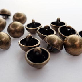
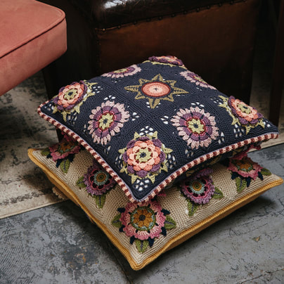
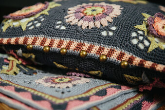
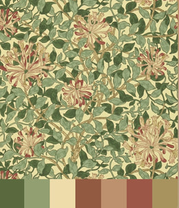
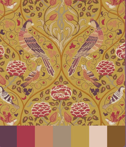
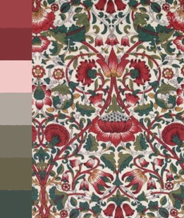
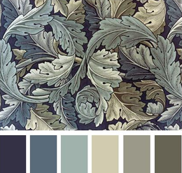
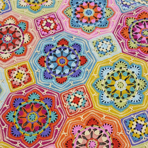
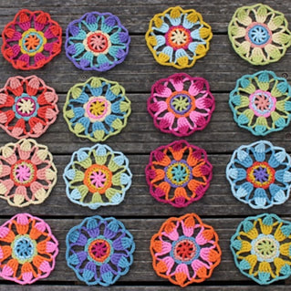
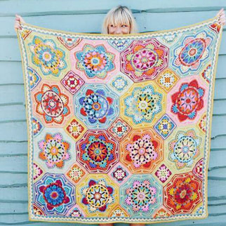
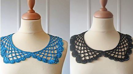
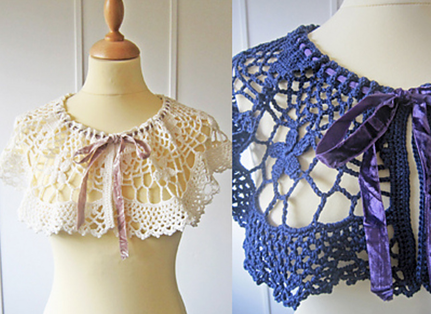
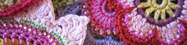
I would love to know what colours you love and what palettes you are drawn to. If you have always been a bit timid about colour or scared of making the wrong choices (which is impossible as there is no such thing btw!) then I hope this piece may have encouraged you to think a bit more 'outside of the box' as far as your choices are concerned.
 

​***
A Little Foray into Dressmaking
Gemma Biggs

Just over a year ago I completed a 10-week dressmaking course and whilst I’ve yet to adorn my body with the linen tunic top I made on the course (possibly due to the fact it needs a good iron and the iron and I aren’t particularly well acquainted), I seem to have caught the bug for making my own clothes.
 
I have never been a happy clothes shopper. It has always felt like a peculiar form of torture, with nothing fitting quite right. Fits on the hips but gapes at the waist. Tops never long enough once they have accommodated the generous chest I’ve been blessed with by my mother’s side of the family (honestly you’d know we were all related if there was ever a photo of us all in a room together)!
 
So, after putting my linen top away in a drawer, but having purchased a few sewing magazines that came with free patterns as well as some pretty floral cotton fabric in a sale, I decided if I wasn’t to forget everything I had learnt on that course a few months earlier, I needed to get on and make another garment.    I was also truly fortunate around that time to inherit a very special sewing machine from an elderly relative (thank you Aunty Mary) and it seemed the stars were aligning!
 ​
Picture
​One of the most useful things we learnt on the dressmaking course was how to read a pattern and this was an important factor as this gave me the confidence to tackle a garment from scratch on my own.  Dressmaking patterns are a bit scary! They are usually on enormous sheets of very delicate tissue paper, with cryptic markings all over them, like a secret code you can only read if you have been initiated into an exclusive club. Having studied a pattern carefully on the course I was able to put a lid on the panic and settle down to working out what I needed to do.  
 
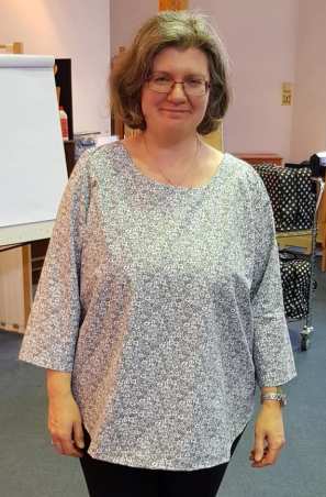
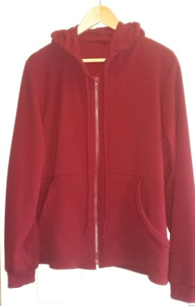
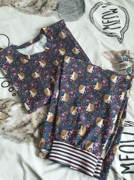
One day later I had a three-quarter length sleeve summer top to add to my wardrobe and I was extremely proud of myself! Up to that point I had made myself crochet garments which had taken months to complete and so the joy of having a completed project just a day later was a real motivation to carry on. The top was followed by a jersey hoodie, a pair of PJ shorts, a short sleeve version of the summer top plus a few bits and bobs for my daughters. Lockdown did not allow much in the way of sewing other than face masks, but when the girls returned to school last week, I finally managed to sew a pair of pyjamas that had been cut out months ago. 
 
Picture
Picture
The thought of going clothes shopping now does not appeal at all. I would much rather decide on the garment I need, spend time browsing in a lovely fabric shop choosing a fabric I really like, and then spending the time planning, preparing, and finally sewing. It is not a cheap option, but if you choose your fabric carefully you can make a garment that fits you well and that you will want to wear again and again, without breaking the bank. It sits a whole lot more comfortably with me too, knowing that I am not wearing something that has been produced for pennies in poor factory conditions thousands of miles away.   
 
Oh, and yes, I am a self-confessed addict of The Great British Sewing Bee now too!
 ​

***

Instagram Favourite
 ​

A couple of weeks ago I came across this great feed and I am now totally addicted to it. If you love fashion and costume then make sure you check out Ladysapientia. Not only does Carly post fabulous images, but she does great background research and posts really interesting stories and facts to accompany the images, like the fact that actress Glenn Close has a clause in her contracts that mean all the costumes she wears on set end up belonging to her once filming is over and that Milena Canonero not only won an Oscar for her costume design for one of my most favourite films 'The Grand Budapest Hotel', but also won them for her costume designs for 'The Shining', 'Chariots of Fire' and 'Marie Antoinette'.
 ​
​The link to this feed on Instagram has just made me think about how films can be a brilliant inspiration for colour palettes too.
 
​If you have seen Grand Budapest Hotel then you must have noticed the dusky pink, red and purple theme that runs through the whole film. Another of my favourites is the first Nanny McPhee film, which has a really bright, almost neon theme running through it, which creates a great contrast with the traditional Victorian style costumes - oh and there are even some neon dyed pink and yellow lambs!!
 

​***
 
It's nearly the Weekend!
 

​As usual we do not have big plans for the weekend. We have had some bags of hardcore delivered so that we can do a bit more work on the front garden (it is a glamorous life!) and we are hoping to get to see Summer and her partner Chris tomorrow afternoon when we plan to join them on a dog walk with Rocky their lovely (slightly bonkers) German Shepherd...

Next week looks set to be busy again, but I am sad that we won't be heading up north to be exhibiting at Yarndale next weekend. The team behind the show have put together a great virtual plan and will be hosting their Yarndale@Home event between 10am and 4.30pm next Saturday and Sunday. The schedule of events is due to be posted on their web site very soon, so you might want to check it out here from time to time so that you can be kept up to date.

Don't forget that if you have any questions you would like answered as part of next month's Q&A you can get in touch by emailing [email protected].

We send lots of love to you all as we head into the weekend. Stay safe and keep well...
Picture
Picture
support me
Picture
Picture

Comments are closed.
    THIS BLOG STARTED IN 2018. YOU CAN FIND MY OLD BLOG BY FOLLOWING
    THIS LINK
    Picture
    SIGN UP TO OUR MAILING LIST BY FOLL0WING
    ​THIS LINK

    Archives

    December 2025
    November 2025
    October 2025
    September 2025
    August 2025
    July 2025
    June 2025
    May 2025
    April 2025
    March 2025
    February 2025
    January 2025
    December 2024
    November 2024
    October 2024
    September 2024
    August 2024
    July 2024
    June 2024
    May 2024
    April 2024
    March 2024
    February 2024
    January 2024
    December 2023
    November 2023
    October 2023
    September 2023
    August 2023
    July 2023
    June 2023
    May 2023
    April 2023
    March 2023
    February 2023
    January 2023
    December 2022
    November 2022
    October 2022
    September 2022
    August 2022
    July 2022
    June 2022
    May 2022
    April 2022
    March 2022
    February 2022
    January 2022
    December 2021
    November 2021
    October 2021
    September 2021
    August 2021
    July 2021
    June 2021
    May 2021
    April 2021
    March 2021
    February 2021
    January 2021
    December 2020
    November 2020
    October 2020
    September 2020
    August 2020
    July 2020
    June 2020
    May 2020
    April 2020
    March 2020
    February 2020
    January 2020
    October 2019
    September 2019
    August 2019
    July 2019
    June 2019
    May 2019
    April 2019
    March 2019
    February 2019
    January 2019
    December 2018
    November 2018
    October 2018
    April 2018

    Categories

    All
    Book Of The Month
    Friday Feature
    Sunshine & Showers
    Temperature Blanket

    RSS Feed

Services

Stockist List
Trade Sales
Returns Policy
Shipping 
​Order Errors

Contact us

About
​Contact
Privacy Policy
​Cookie Policy
​
Terms & Conditions

Support

Technique Downloads
Technique Videos
Fruit Garden Videos
Spirit Of Flora Videos
Sunshine And Showers Videos
Errata
​


General Product Safety Regulation (GPSR) Compliance
EU Authorised Contact: Euify OSS B.V.
Janie Crow Ltd
Prinses Margrietplantsoen 33, 2595 AM
Den Haag, The Netherlands 
​Email: [email protected]
© COPYRIGHT 2015. ALL RIGHTS RESERVED.
  • Home
  • SHOP
  • PROJECTS TO MAKE
    • CROCHET ALONG >
      • BOHEMIAN BLOOMS
      • BLOOMSBURY AND SUSSEX GARDEN
      • CLIMBLING ROSE WRAP
      • FRIDA'S FLOWERS
      • INDIGO AND CRIMSON DREAMS
      • LILY POND
      • LOVE IS ENOUGH
      • SUNSHINE & SHOWERS
      • SPIRIT OF FLORA
      • THE FRUIT GARDEN
    • BLANKETS & THROWS >
      • DELFT
      • EASTERN JEWELS
      • FIELDS OF GOLD
      • FIORI
      • IMOGEN
      • INDIAN ROSES
      • JEWELLED STAR
      • MAGIC CIRCLES
      • MARRAKESH PERSIAN TILES
      • MEXICAN DIAMONDS
      • MYSTICAL LANTERNS BLANKET
      • PEPPERCORN PERSIAN TILES
      • PERSIAN TILES
      • ROYAL GARDEN
      • SANDALWOOD
      • SUMMER PALACE BLANKET
      • THE BLUE HOUSE
      • WILLOW BLOSSOM
    • SHAWLS & WRAPS >
      • GLAD TIDINGS WRAP
      • HOLLICARRS
      • LOTUS FLOWER
      • MAGIC CIRCLES
      • MEXICAN DIAMONDS SCARF
      • MYSTICAL LANTERNS SCARF
      • MYSTICAL LANTERNS SHAWL
      • SUMMER PALACE WRAP
    • CUSHION COVERS >
      • KELMSCOTT & MELSETTER
      • GERTRUDE & MURIEL
      • OONAGH
    • DECORATIONS >
      • BEADED DECORATIONS
      • FESTIVE DECORATIONS
      • FESTIVE MINI STOCKINGS
      • GLITZY STOCKING
      • JULIE'S BUNTING
      • SPARKLE & SHINE BEADED DECORATIONS
      • TWINKLE BUNTING
    • ACCESSORIES >
      • BEADED PINE WINTER MITTS
      • BEADED POUCHES
      • CATALINA BEADED POUCH
      • HALLEY BEADED POUCH
    • FREE PATTERNS >
      • EMILY SHAWLETTE
      • ESTELLA
      • TEMPERATURE BLANKET
  • BOOKS
  • RESOURCES
    • LEARN TO CROCHET
    • FREE TECHNIQUE DOWNLOADS
    • YARN SUB DOCUMENTS
    • ERRATA
  • NEWS
    • BLOG
  • ABOUT
    • DECADE OF DESIGN
    • EMMA BALL & JANIE CROW
    • MARY MAXIM & JANIE CROW
    • YARNSMITHS & JANIE CROW